
Glamourous presence
logo design | website design | brand identity | search engine optimization | web hosting | domain registration | planning | management
Evenimente by Niki is a company that specializes in organizing wedding and baptizing events, corporate parties and more. They have their own restaurants, flower shops and are by far the best event planners in Bistrita.
We developed their original logo and search engine optimized website in 2006. They got many clients through the site since then and recently asked us to redesign, rebrand, update and upgrade it to get even more sales.
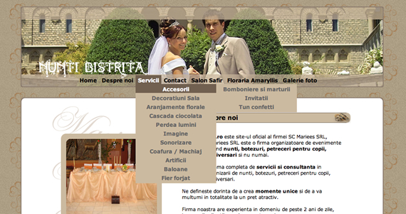
Screenshot of the 2006 website
The challenge
The biggest challenge with the original website was the fact that it needed to be ranked high, number one in Google and other major search engines. Prior to the launch of Evenimente by Niki's website back in 2006, their 3 main competitors in the local area of Bistrita had already estabslihed websites which ranked well in search engines.
Evenimente by Niki's main service is planning wedding events, therefor they wanted to be the top result for specific keywords such as "nunti bistrita" — "weddings bistrita" in English. As they also offer a wide range of similar services, the secondary goal for this project was to attract visitors towards these services. The website needed strong content, correctly structured and optimized.
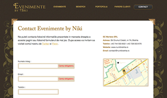
The solution
We didn't want to rush into it. We studied Evenimente by Niki's competition for a couple of months as we wanted to see how their websites evolved in time. We needed to know their strengths and weaknesses in order to exploit them and make a successful winning strategy for our client's website.
Before we even started sketching the new website, we already knew how it should be structured in order to get to the top and knock out the competition. Few weeks from launch day, the newly created website showed up in Google's and Yahoo's search results for the needed keywords. However, it wasn't on top of the list and that wasn't acceptable.
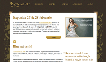
Therefor we further optimized the content and in just a couple of months the website got to the top of the search results. Today the website still has the number one listing and secondary keywords also trigger results on the first page.
Through their website, Evenimente by Niki has managed to land clients living abroad, emigrants that left Romania, but who wanted to have their weddings back home with their families and friends.
The challenge & solution of 2010's project
In 2010, after four years of success with the first website, Evenimente by Niki's wanted to rebrand themselves. They came in and talked to us just a couple of weeks before the deadline. They wanted the rebranding process to be finished before they attend to a fabulous weddings showroom. The easy part was that we now knew everything about the business, its core values and what they wanted to achieve with their new brand. The tough part was developing new concepts, new brand identity, new logo and a new website in a matter of weeks. But we love working under pressure and the final outcome was gorgeous.
visit Evenimente by Niki's website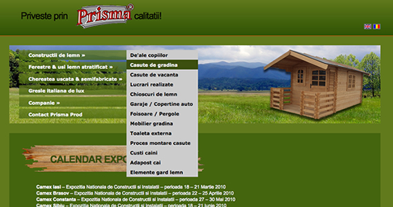
Mammoth website
website design | user interface | web application | web hosting | search engine optimization | planning | management
PrismaProd already had an old website when they came to us. It used technologies that were already obsolete at that time making the website unusable on a couple of web browsers. The only way we saw in reviving their online presence was to develop a new website from scratch, using modern technologies.
The process
PrismaProd's old website had tens of pages which were statically built, meaning that its maintenance costs were not high, but huge. Basic math showed us and to our client that if done right, a new website would turn to profit in under 6 months. We agreed on developing a new one, but this came packed with one big challenge.
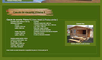
The website needed two different languages, hundreds of pages, dynamic areas, tracking and more, making it a mammoth project. Hundreds of products with different characteristics spread across multiple pages which should be easily accessible.
We kicked off the project with a couple of days of on site material gathering. Our team traveled 100 km to our client's office, warehouses and plant. During these days we had the chance to get to know the company and its employees, what they're after and want to achieve, and get the much needed content and multimedia data.
The sheer amount of data was enormous and one of the biggest issues was figuring out the way to present it online.
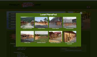
The new website was launched in under a month and turned out to be a major hit. Within hours from launching it, PrismaProd started getting new orders. Traffic costs went down while visitors numbers and sales went up.
However, we can't say that PrismaProd's website is complete even today because there's always new products to insert, new content to optimize and aspects to tweak for making users feel better. The site started with around 100 pages and currently has 250 or more. The number of products tripled and almost everything had to change throughout the growth.
The navigation system wasn't originally designed to cope with such a great number of pages and sections, and we had to rebuild it entirely while making sure that the new one wont break the overall user experience, layout and functionality of the website.
Some nice numbers?
More than 800 new contacts and more than 500 products sold since the site was launched. And we're talking about houses, not household appliances and alike. Such a great success!